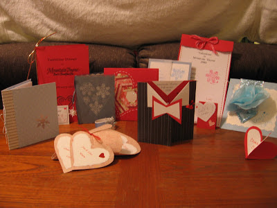
I was working on our menu cards for this year's Valentines Dinner, (you will have to wait until later to see this one), and I thought it might be fun to drag out the ones from years past and have a look. You might get some fun ideas for a party or event you are planning. I must say I am glad these were made pre-Pinterest days. Seeing some of the marvelous examples out there, I might have been intimidated to ever try.
Speaking of Pinterest, and I know from several funny blogs out there I'm not alone on this, we need to get over our "Pinterest Perfection" expectations. More on this next week when I show you pictures of my cinnamon twist that needs some practice.
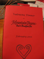
That first year that we started offering the Valentine's candlelight dinners, the printed menu was an afterthought, hurriedly printed off the day before. It was simply red cardstock for the cover, white printer paper for the lining, black type, some gold stamp ink and stretchy red/gold package twine left over from Christmas wrapping. It turned out to be a fun little souvenir that folks enjoyed from their romantic weekend out.
The next year I spent some time thinking about it and came up with something a little fancier. We alternate color schemes each year between red and blue (winter, snowflakes, etc). I started with a smokey blue velum for the cover. I cut out a heart template to place on top and then stamped snowflakes with white ink inside. I finished off the design with a running stitch-like border with a white colored pencil.
The inside was simply a white cardstock trimmed with scalloping scissors. The snowflakes inside were stamped with a denim ink and the pages were held together with a thin smokey blue ribbon with a tiny 3D snowflake tied to the tip
 Another red themed menu was a thick, textured red card stock, folded over at the top, the edge coarsely torn, holes punched through red and white cards, and tied with multicolored pink & red embroidery thread. The red border and hearts between courses printed off the computer and the stamps were left over from previous years. (You can ignore the snowflake imperfection shown here -- I always keep the rejects for my scrapbook). The place cards were cut from the same paper and hand decorated.
 This next attempt was a little more time consuming. I took my inspiration from a little book that was made for my mother's high school graduation. You start with two pieces of card board. The silver strip paper was glued to both pieces to bind the book. The polkadot paper was glued to the outside of each piece of cardboard, leaving an inch of silver stripe showing, and wrapping 1/2 inch around the other sides. The inside of the cardboard was covered with contrasting heart paper. (I used a glue stick for most of this but had to reinforce
  a few spots.)
The pages inside consisted of one sheet of frosted velum and two sheets of light weight cardstock. The first page was the title with the individual menus on the center pages. The silver snowflake on the front was a rub-on decal and the pages were bound to the cover with silver ball/string that I cut off the edges of some wired ribbon.
 This card was inspired by a handmade Christmas card. It is simple but time consuming. But, it allowed me to use up lots of the red, white, and pink papers I had from years before. It is kind of like making a log cabin quilt. Strips of paper are just laid on and glued around a sparkly sheet of paper until there is enough to fill up the space. I used the white colored pencil to "stitch" around the edge. Another sheet of red is glued to the underside to keep the quilt in place and finish off the inside. The inside was printed on white card stock and held in place with little sticky snowflakes
The idea for this card came to me from a handmade wedding invitation. The base of the menu and the name card are cut from a textured blue card stock.
The white menu is printed in blue ink to match the ink I had for the snowflake stamp. (It has been used many times in many colors). The velum surrounding the menu and layered on the name card was frosted with little glittery speckles (which are hard to see here). The menu was tied with frosted ribbon with a little snowflake stamped heart. The layers on the name card (after being glued together) are accented with sticky snowflakes.
This next menu got its inspiration from some wonderful thick handmade paper I got in Dallas. If you love paper and if it is still there, check out a place called Paper Routes. You will think you have died and gone to heaven.
My favorite was an original design.
My friend, Janie, and I wanted a formal looking menu for our 10th anniversary. (We opened Valentines weekend, 1998).
When we decided on a tuxedo, the rest was just cutting and pasting paper until we came up with something we liked.
The pinstripe is a light weight paper. Heavy card stock would have been better but I couldn't find anything that worked. The red for the vest and the white accents are heavier paper. The vest buttons were stick-on white hearts and the red flower in the jacket are red berries on green wire (floral dept) that we stuck through the paper and covered with red hearts front and back. The menu is held together with that "repositionable" glue. The name cards were made by taking two hearts, cutting a slit half way up the bottom of one and half way down the top of the other. Holding the two perpendicular, slide the bottom slice on top of top slice. Glue the white heart on to create a 3D standup.
I hope these inspire you to greater things. I'm sorry I didn't have pictures of the process but these were made pre-blog. I will do a better job of documenting this year and will share the results in March after all the dinners are over.
I came up with a cone shape that resembled a heart when rolled up. The cone is tied closed with ribbon in two small hole punched in the front. The name cards were simple heart shapes. The white linings for the menu and place cards (heart shaped) were hand torn to fit the shape. (Just pencil the shape on the back side of the paper and gently tear along the line). Inside the cone, the top heart was placed to peak out the top and the two menu cards were lower and overlapping. The little red hearts were the old fashioned lick & stick foil kind.
Last year I wanted to try making fun tissue paper flowers that I was seeing all over Pinterest. It was simply pale blue card stock, glittery wide ribbon, white card stock cut with those scollop scissors and a blue carnation glued on. The names were hand lettered on the front. The interior was printed computer except for the snowflake stamps.
I hope these inspire you to greater things. I'm sorry I didn't have pictures of the process but these were made pre-blog. I will do a better job of documenting this year and will share the results in March after all the dinners are over.


You are so clever and creative! I like that quilted heart.
ReplyDeleteThanks! I always look forward to creating these menus.
DeleteJanet, I just followed the link back to your blog. How did I not know you had such a wonderful site (or a site at all?) Sorry to have been so busy I didn't notice...it is wonderful!!
DeleteI haven't advertised it at all. Just doing it for fun. And I'm having a lot of fun doing it! I notice you've been spreading the word! Thanks for the nice words of approval!
ReplyDeleteIt is a WONDERFUL site. I told Janie (a teacher of young children and lover of kids books) to take a look. She may contact you with some of her favs. Also, Julie's little girl is about two so I suggested she become a follower! Keep up the great work.
ReplyDeleteWow awesome cards, you are surely very creative and have a great insight in card building.
ReplyDelete